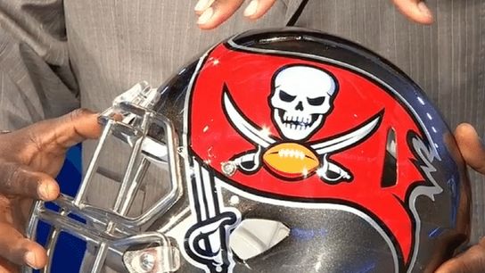
A year ago, the Miami Dolphins unveiled an "enhanced" new logo, which really wasn't a new logo at all but more like a modernized version of the same thing. On Thursday night, it was the Tampa Bay Buccaneers' turn.
The team that brought us the creamsicle uniforms and the NFL's first pewter kits will now have a helmet that is.... black? pewter? silver? Yes to all three.
It's worth noting that Nike has taken over the NFL's uniforms, so the same folks behind the oversized logo trend in college football have now migrated up a level.
Below are Tampa Bay's new wordmarks, primary logo and secondary logo.

So, is this an improvement on the Bucs' visual branding, or change for the sake of change?
