On signing day, all programs are not created equal, but one area that programs seem to have be on an even playing field is the creation, and execution of graphics to promote the program. Every program seems to have a guy that can whip up some sweet graphics when the occasion calls for it, and no occasion is more fitting than National Signing Day.
Christopher Kaiser, Michigan's assistant director of marketing partnerships, kept a really great tab on a lot the different infographics that were used throughout 2014's signing day, which was a big help in putting together this list. You can see his full collection here.
I decided to take a look at all the graphics I could get my hands on, and comprise a list of the ones that looked the most crisp, and appealing overall. Many programs took very different approaches, but here's my list of the big winners.
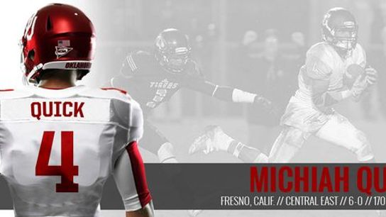
#10 - Oklahoma: Simple, clean, and effective
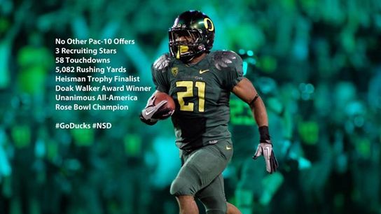
#9 - Oregon: This is Oregon's way of saying, "Screw the 'star rankings'. If our coaches are targeting you, there's a really good reason why."
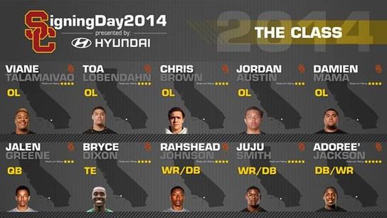
#8 - Southern Cal: I really like the way USC set this up, especially the layout of the state (and hometown location) behind the player. Well executed.
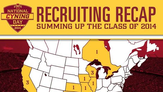
#7 - Iowa State: Another one in the simple, and effective category, with bonus points for the "CYNING" day creativity.
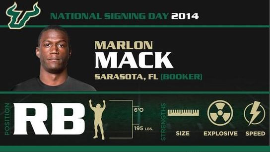
#6 - South Florida: Really well done infographic style announcement, with a good excerpt from ESPN talking about the strengths of the recruit to help inform the fan base. Including the star rankings is another nice touch.
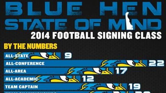
#5 - Delaware:The only FCS school to make the top 10, Delaware went the infographic route, and hit a home run in my opinion. Lots of great information in this one, and it's set in a way that makes you WANT to read every bit of it.
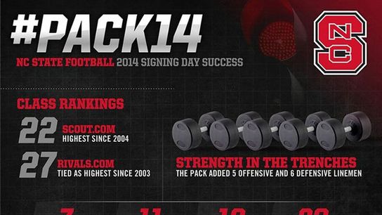
#4 - North Carolina State: Crisp and clean infographic that gets across all the pertinent information of the 2014 singing class and their accomplishments. Another one that makes you want to read every nugget its got.
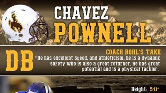
#3 - Wyoming: Wyoming does a great job with everything from the state inspired background to the font in this one, and is the only one in the top ten to include the head coach's take on a specific recruit. Very well laid out and appealing.
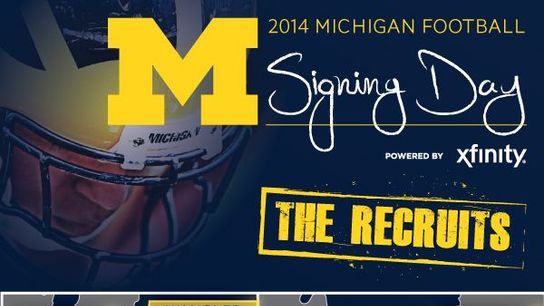
#2 - Michigan: Although you can't get the full feel for it here, Michigan went the interactive infographic route, allowing viewers to click on a players name to get a full profile on each of the signees. The "Make your commitment official" season ticket line at the bottom is also a nice play on the excitement of signing day.
#1 - Oregon State: Simple and impressive. A dangerous combination. The research that went into this one (counting up all the staff's miles) is downright impressive. Brilliant idea.

(H/T Christopher Kaiser)
